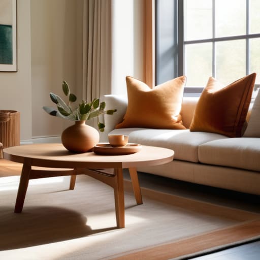
I remember standing in the middle of my first tiny apartment, surrounded by ten different swatches of “eggshell” white that all looked suspiciously like hospital hallways, feeling like a complete failure because I couldn’t make my living room look like a curated editorial spread. I spent three weeks spiraling over every shade of beige, convinced that if I didn’t master the high-level theory of how to choose a color scheme, my home would forever feel chaotic and cheap. But here’s the truth I learned the hard way: you don’t need a degree in interior design or a massive budget to create a space that feels cohesive; you just need to stop trying to mimic a magazine that doesn’t actually live in the real world.
In this post, I’m stripping away the intimidating jargon and the performative perfection you see on your feed. I’m going to show you my actual, tested methods for picking colors that work with your existing furniture and, more importantly, your actual lifestyle. We’re going to focus on functional palettes that make your space feel intentional without making you feel like you’re living in a museum. No fluff, no expensive mistakes—just simple systems that actually work.
Table of Contents
Forget the Trends Using Color Theory for Interior Design
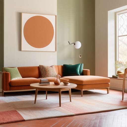
Look, I get it. You scroll through your feed and see these hyper-curated, moody rooms that look incredible in a static photo but feel like a cave the second you actually try to live in them. Instead of chasing whatever “color of the year” is currently trending on TikTok, I’m a huge advocate for leaning into the actual color theory for interior design. It sounds intimidating, like something you only need a degree for, but it’s really just about understanding how colors play together. If you want a space that feels cohesive rather than chaotic, you don’t need a designer; you just need to understand how certain hues interact.
For example, if you’re feeling stuck, I always suggest playing with complementary color combinations to add some life to a dull corner. It’s about balance—pairing something bold with something that grounds it. If you’re leaning toward warm vs cool color palettes, just think about the vibe you want. Do you want a cozy, sun-drenched kitchen that feels like a hug, or a crisp, calm bedroom that helps you actually shut your brain off at night? Pick the feeling first, then let the colors follow.
Warm vs Cool Color Palettes Pick What Feels Real
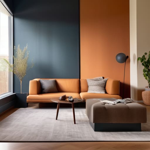
This is where things usually get a little overwhelming, but let’s strip it back. When we talk about warm vs cool color palettes, we aren’t just talking about picking a pretty shade of beige; we’re talking about how a room actually makes you feel when you walk in after a long day. I used to think I needed a crisp, cool grey in every corner because it looked “modern,” but it ended up making my apartment feel like a sterile doctor’s office. I realized I was designing for a magazine, not for my actual life.
If you want a space that feels like a hug, lean into those warmer tones—think terracottas, soft ochres, or creamy whites. They bring a sense of coziness that’s hard to beat. On the flip side, if you’re working in a tiny, cramped home office, a cooler palette with blues or soft greens can actually help you feel more focused and calm. There’s a real psychology of color in rooms that dictates whether you’ll want to nap there or get some serious work done. Don’t overthink the rules; just listen to your gut.
5 ways to pick a palette without losing your mind
- Start with what you already own. Before you go buying a dozen swatches, look at that rug you love or that one chipped ceramic vase that somehow makes you happy. Use those existing pieces as your anchor; it’s much easier to build a room around something real than to try and force a brand-new vibe onto a space that doesn’t want it.
- The 60-30-10 rule is your best friend. Don’t try to make every single thing a focal point. Aim for 60% a dominant neutral, 30% a secondary color, and 10% for those “personality” pops. It keeps the room from feeling chaotic while still giving you room to play.
- Test your colors in actual light, not just under the harsh store LEDs. I can’t tell you how many times I’ve bought a “calming sage” only to realize it looks like a swampy mess in my dim living room at 4 PM. Grab a few samples, paint them on scraps of poster board, and move them around your room throughout the day.
- Don’t forget about the “vibe” of the room’s function. If you’re picking colors for a bedroom, you probably don’t want high-energy, neon yellows that make you feel like you’ve had three espressos. Match the intensity of the color to what you actually do in that space.
- Embrace the “ugly” neutrals. We often get caught up trying to find the perfect, creamy, expensive-looking beige, but sometimes a slightly greyish or muddy tone is what actually makes the room feel lived-in and cozy. If it feels grounded and doesn’t give you a headache, it’s a winner.
The "No-Stress" Color Cheat Sheet
Stop trying to match a magazine; pick one color you actually love and build the rest of the room around it so you aren’t constantly second-guessing your choices.
Use the 60-30-10 rule to keep things balanced—60% a dominant neutral, 30% a secondary color, and 10% for those bold accents that give the room personality.
Always test your paint samples in your actual lighting at different times of the day, because a “perfect” beige can easily turn into a depressing gray once the sun goes down.
The truth about color
Stop trying to paint your home to look like a showroom; pick colors that actually make you want to sit on your sofa and stay a while.
Maya Sterling
Stop Overthinking and Start Living
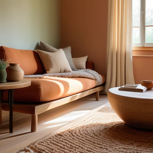
At the end of the day, choosing a color scheme isn’t about passing some unspoken design exam; it’s about making sure your four walls actually support the way you live. We’ve talked about moving past fleeting trends, understanding how color theory can ground a room, and deciding whether you need the cozy embrace of warm tones or the calm clarity of cool ones. Just remember: you don’t need a professional degree to make a choice that works. If you focus on how a color makes you feel when you walk through the door after a long day of work, you’re already ahead of most of the people I see on my feed. Functionality over perfection, always.
If you’re still feeling paralyzed by a dozen different swatch samples, here is my best piece of advice: just pick something. Your home isn’t a museum, and it isn’t a static photograph; it’s a living, breathing space that is allowed to evolve as you do. If you paint a room and realize a month later that the blue is a bit too aggressive, you can change it. The goal isn’t to get it “right” on the first try, but to create a foundation that makes your daily routine feel a little more seamless. You’ve got this, and honestly, your home will thank you for finally making a decision.
Frequently Asked Questions
I’m terrified of picking a color and realizing I hate it in a week—is there a way to test these shades without repainting the whole room?
I totally get that panic; I once spent three days staring at a “soft greige” sample before realizing it looked like wet cement in my living room. Please, don’t commit to a gallon just yet. Grab a few peel-and-stick samples or even just paint large pieces of poster board. Tape them to different walls and watch how the light hits them from morning to night. It’s a little extra work, but it beats the heartbreak of a total repaint.
How do I actually balance colors so the room doesn't end up looking like a chaotic mess or, on the flip side, a boring hospital ward?
Look, I’ve definitely been there—either staring at a room that feels like a sensory overload or one that’s so beige it feels like a waiting room. My go-to fix is the 60-30-10 rule. It’s not just for designers; it’s a sanity saver. Aim for 60% a dominant neutral, 30% a secondary color, and 10% for those bold “personality” pops. It gives your eyes a place to rest while still letting you actually live.
Do I really need to worry about matching my existing furniture, or can I just pick colors I love and make it work?
Look, I’ll be the first to tell you: don’t let a mid-century modern chair hold your entire room hostage. You don’t need a perfect match; you need cohesion. If you love a color, go for it. The trick is to find one common thread—maybe it’s a similar wood tone or a subtle metallic accent—to tie the new paint to your old sofa. It’s about balance, not a matching set from a catalog.